
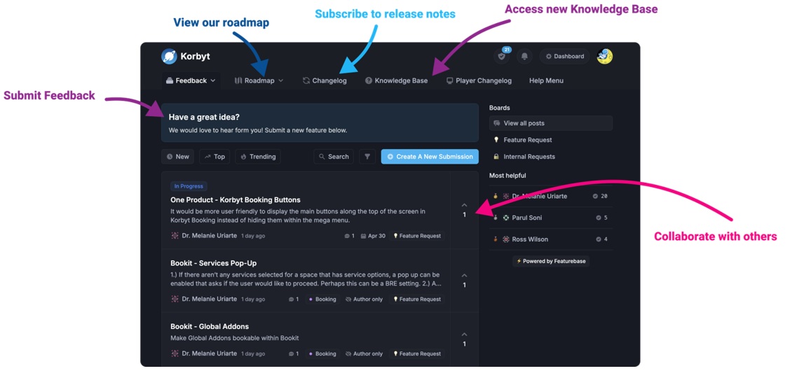
Our Knowledge Base Has Moved
The New Page landing page for the Knowledge Base is https://product.korbyt.com/help
The new version of this specific article can be found at: https://product.korbyt.com/help/articles/7126272-using-the-builder-tool-for-layouts-or-messages
Please update any of your bookmarks to the new Knowledge Base
For assistance on using the new Knowledge Base, we have a Welcome to the New Korbyt Knowledge Base guide
The new Korbyt Product Page also has sections for submitting feedback on system improvements, a view of our Roadmap of upcoming enhancements, and a change log of all updates.
The Builder Tool is the GUI-based design system in Korbyt that allows you to create new Signage Layouts or Desktop Messages.
Both interfaces are very similar and function the same from a creative tool standpoint, but each has some options that are unique to either Signage Layouts or Desktop Messages
This article is going to focus on the Builder Tool itself, if you need information on the options and steps for creating or managing layouts please see
Creating and Managing Layouts – Classic Experience
Creating and Managing Layouts – New Experience
Creating and Managing Desktop Messages (InViews)
This Article Reviews
- Control Panel Options
- Adding and Controlling Elements
- Arranging Element Layers
- Saving and Publishing
If you are familiar with the topics covered in this article you may want to review the Layouts and Messages – Advanced User Guide article
Builder Control Panel Options
The Control panel is the main interface used in the Builder Tool to create your design
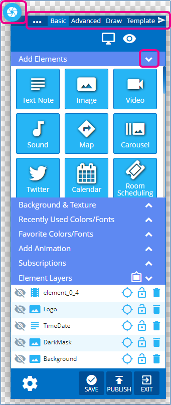
- The control panel can be collapsed down using the aperture icon in the top left
- The control panel has multiple sections across the top that change what is available
- Basic, Advanced, Draw, Template
- The sections of the control panel can be collapsed or expanded using the arrows to the right of the headers
Advanced Control Panel
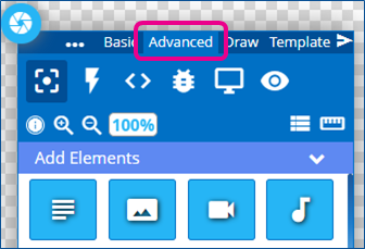
The advanced view of the control panel exposes more control icons at the top and shrinks the element icons in the Add Elements section
| Control Icon | Description |
|---|---|
 |
Display Control – Sets the Shape, Resolution, and Orientation of Canvas Available in both basic and Advanced Views of the control panel |
 |
Preview – Opens a new window to see the design in action (Playlist Elements will not preview in Builder Tool) Available in both basic and Advanced Views of the control panel |
 |
Elements – Shows the Element Icons and normal Control Panel sections |
 |
Actions – Opens the window for creating interaction and code-driven changes to the design |
 |
CSS and JavaScript – Changes the Builder tool so that you can interact with the CSS and JavaScript inside the design |
 |
Console – Opens the console window for coding |
 |
Zoom– Zoom in or out on the canvas without zooming the rest of the interface You can also use your browser’s zoom ability, but that will zoom in or out on everything |
 |
Ruler – Makes a Ruler visible |
 |
Resources – Opens the list of coding resources available |
The Follow Icons appear in Advanced View when One element is selected on the canvas
| Control Icon | Description |
|---|---|
 |
Center Horizontal – Moves the selected element to be centered horizontally on the screen Only appears when 1 element on the canvas is selected |
 |
Center Vertical – Moves the selected element to be centered vertically on the screen Only appears when 1 element on the canvas is selected |
 |
Delete – Deletes the element Only appears when 1 or more elements on the canvas are selected |
The Follow Icons appear in Advanced View when Two or More elements are selected on the canvas
You can select multiple elements on the canvas by holding the control key
| Control Icon | Description |
|---|---|
 |
Align Horizontal – Aligns multiple items horizontally After clicking you choose between left, right, or center aligned |
 |
Align Vertical – Aligns multiple items vertically After clicking you choose between top, bottom, or middle aligned |
|
Space Horizontal – Distributes multiple items horizontally After clicking you choose between Space Around the items or Space Between |
|
Space Vertical – Distributes multiple items vertically After clicking you choose between Space Around the items or Space Between |
 |
Sizing– Resize multiple items at once Can see and set both item’s sizes |
 |
Group– Group multiple items together |
|
Delete – Deletes the element Only appears when 1 or more elements on the canvas are selected |
Adding and Controlling Elements
Click and Drag your desired Elements from the control panel to the canvas area.
The same Elements are available in both the Basic and Advanced Control Panel views:
For a full list of available Builder Tool Elements see the article Layout and Message Builder Elements
When you drag an Element to the canvas area it will create a container for the element.
This container will have a red outline when you have it selected, and a faint blue outline when you are not interacting with it (these outlines do not show on the final screen)
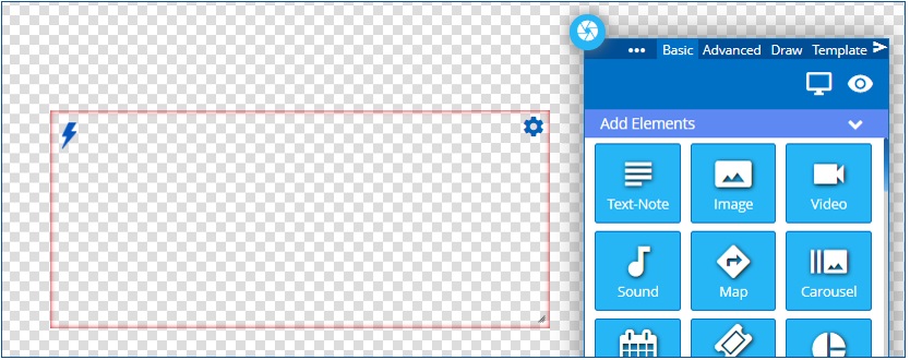
Three corners have controls available if you move your mouse over the area and click
- The Lower Right Corner is where you can click and drag to resize the Element
- The Upper Left Corner is where you can edit Triggers that affect the Element – Lightning Bolt Icon
- The Upper Right Corner is where you can open the Settings Menu to Edit the Element or its Properties – Gear Icon
- The Edit Element controls list the element type and then offer different setting types
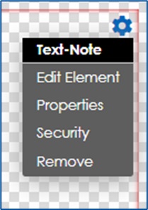
- Edit Element has settings that are unique to that element type
- This is how you select a font, set the URL for an External URL Element, or set the sizing behavior for an image
- Different elements have different settings.
- The Layout and Message Builder Elements links to articles for each element’s settings
- Properties opens a control panel that affects the container
- Such as setting the background color for the contain or setting the container size
- For more details on properties see Properties Menu For Elements In The Builder Tool
- Security allows the element to be locked to user groups
- This setting is only available for Tenant Administrators
- Remove deletes the element from the canvas
- Edit Element has settings that are unique to that element type
- The Edit Element controls list the element type and then offer different setting types
Arranging Element Layers
When each Element is added to the design a new layer will be created for that element
The layers can be seen and adjusted in the Element Layers section of the control panel
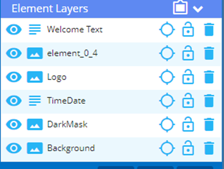
- New Elements added will create a new layer at the top of the list in the Element Layers section of the control panel
- The further down the list an element is the further is back in the design
- The item at the bottom is the furthest back, and the item at the top is sitting in front of all the others
- Elements layers can be adjusted by clicking and dragging up or down the list
- Layers can be renamed
- When created they have a default name of element_#_#
- Double-clicking on a layer name will let you rename it
- Click enter to lock in your change
- The icon next to the name shows what type of element it is and matches the icon from the Add Elements section
- As you move your mouse up and down the list, you will see each corresponding lament highlighted in red on the design
- If you click on an element in the list it will select the element in the design
- If you click on the icon that represents the element type it will open the elements editing menu
- The Eyeball icon will make the layer visible/invisible
- The crosshair icon will animate the element to show it on the canvas
- The padlock will lock the element from accidental changes
- The Trashcan will delete a layer
Saving and Publishing
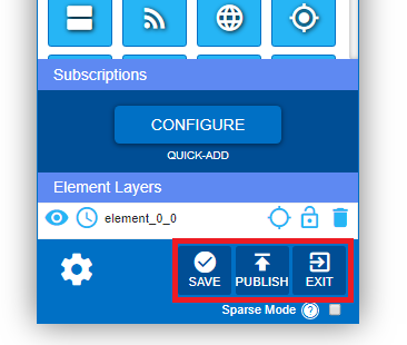
Saving vs Publishing
When you are at a place you are happy with in your design it is advised to use the Save button at the bottom of the control panel to lock in your work. Otherwise, if you close your browser or navigate away from the builder tool all unsaved progress will be lost.
Saving will set the design to Draft status
Publish will not only save your work, but it will now be available to be shared and added to a playlist.
Saving without publishing only creates a record of your layout where you can still modify your content, but your layout will not be usable with other features across Korbyt Anywhere.
Wand to do more in Korbyt Builder Tool?
Review the Layouts and Messages – Advanced User Guide