
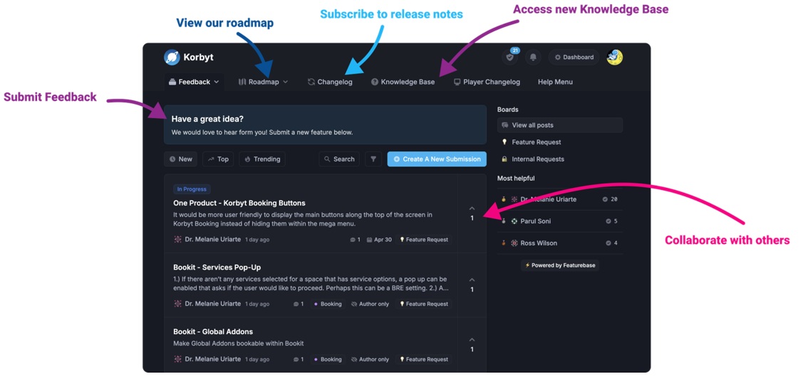
Our Knowledge Base Has Moved
The New Page landing page for the Knowledge Base is https://product.korbyt.com/help
The new version of this specific article can be found at: https://product.korbyt.com/help/articles/7126272-using-the-builder-tool-for-layouts-or-messages#oka0fskbtey
Please update any of your bookmarks to the new Knowledge Base
For assistance on using the new Knowledge Base, we have a Welcome to the New Korbyt Knowledge Base guide
The new Korbyt Product Page also has sections for submitting feedback on system improvements, a view of our Roadmap of upcoming enhancements, and a change log of all updates.
Advanced Layout Settings and Options
In this article, we will review advanced controls for Layouts
If you are not familar with the basics of Layouts please start with Using The Builder Tool For Layouts Or Messages
This Article Reviews
- Custom JavaScript and CSS Editor
- Interactivity in a Design through Quick Actions
- Animation Timeline
- Magic Animation
- Recently Used & Favorite Colors/Fonts
- Subscriptions
- Draw Control Panel Section
Custom JavaScript and CSS
This is an advanced builder feature where you can create, edit, and save JavaScript and CSS for the elements in your layout.
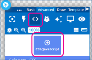
To open the JavaScript and CSS control panel
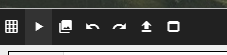
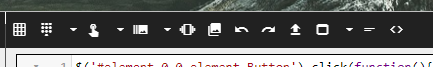
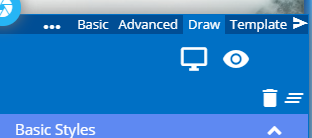
- In the Builder Tool, select the Advanced tab of the control panel
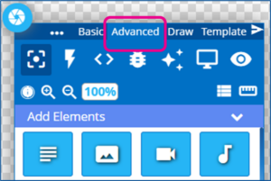
- Click on the <> toggle, and then Click the CSS/JavaScript button
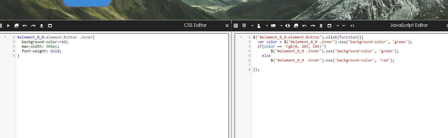
CSS Editor – Left Menu
- Glow – This option highlights all elements in the builder where you will be able to see important information such as the element id and classes.
- Send to preview – Selecting this option allows us to update the preview of your layout with updated CSS.
- Redo/Undo – Revert changes or undo reverts you make
- Save snippet – This will let you save the code snippets you create.
- Maximize/minimize – This will expand or shrink the editor to the dimensions of the page.
JavaScript Editor – Right Menu
- Glow – This option highlights all elements in the builder where you will be able to see important information such as the element id and classes.
- Data ruler builder – This option will allow you to insert JavaScript based on data subscription rules.
- Touch – This option allows you to add functions where you can zoom or pan on a builder element.
- Carousel – This option allows you to add functions that can modify the behavior of the carousel element.
- Choose Image – This option allows you to add an image reference to your editor
- Redo/Undo – Revert changes or undo reverts you make.
- Save snippet – This will let you save the code snippets you create.
- Maximize/minimize – This will expand or shrink the editor to the dimensions of the page.
To return to the Elements view of the control panel, click the Elements toggle
Interactivity in a Design through Quick Actions
Quick Actions allows designers to embed interactive logic and macros into any Layout.
This is done by using the UI to select an element, configure a trigger, and then the desired response.
You will want to have added your elements to your design before following these steps
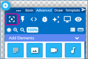
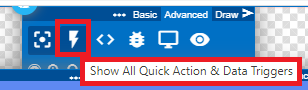
- In the Builder Tool, select the Advanced tab of the control panel
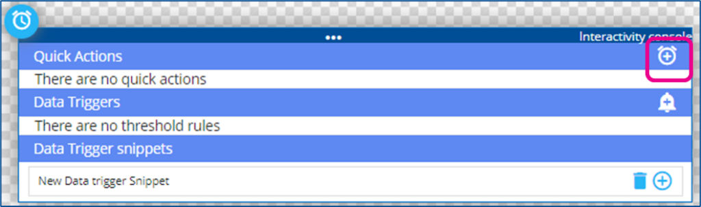
- Click on the Lightning Bolt icon to open the Quick Actions and Data Triggers panel
- If you have not added any elements to your design yet, you will only see the option for snippets
- To add a New Quick Action, click the + to the right
- Select Element – You will then be asked to select an Element
- This is the element of the design that is going to be monitored for the intended trigger
- It will be helpful if you have renamed your element layers to be clear to you
- Tigger: After Selecting the Element you will select a Trigger from the drop-down
- Click – the element is clicked/tapped
- isShown – if the element is set to be shown
- isHiden – if the element is set to be hidden
- Timer – Set an amount of seconds
- Action: Select the desired result from the drop-down
- Show / Hide / Toggle Visibility – all change the state of an element displaying or not on the design
- Add / Remove Class – Changes the classes of the element
- Animate – Triggers a selected animation on the target element
- Reload – Refreshed and reloads the target element
- SubZone – Provides interactive instructions inside of an existing element calling up a webpage or another design
- Player – Passes instructions to the player
- Playlist / Carousel API – Passes instructions to a specific type of element to control the changing of items shown
- Target: The item that the action will be taken on
- Interaction / Class / Time
- There may be new section that appears to the far right depending on the type of action and target element where further configuration may need to be set
- In this example, A quick action has been built to allow a user to move the Playlist to the next item, by clicking on the Next Button
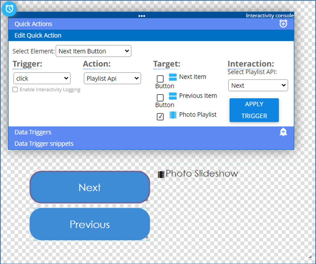
- Click Apply Trigger to save the action
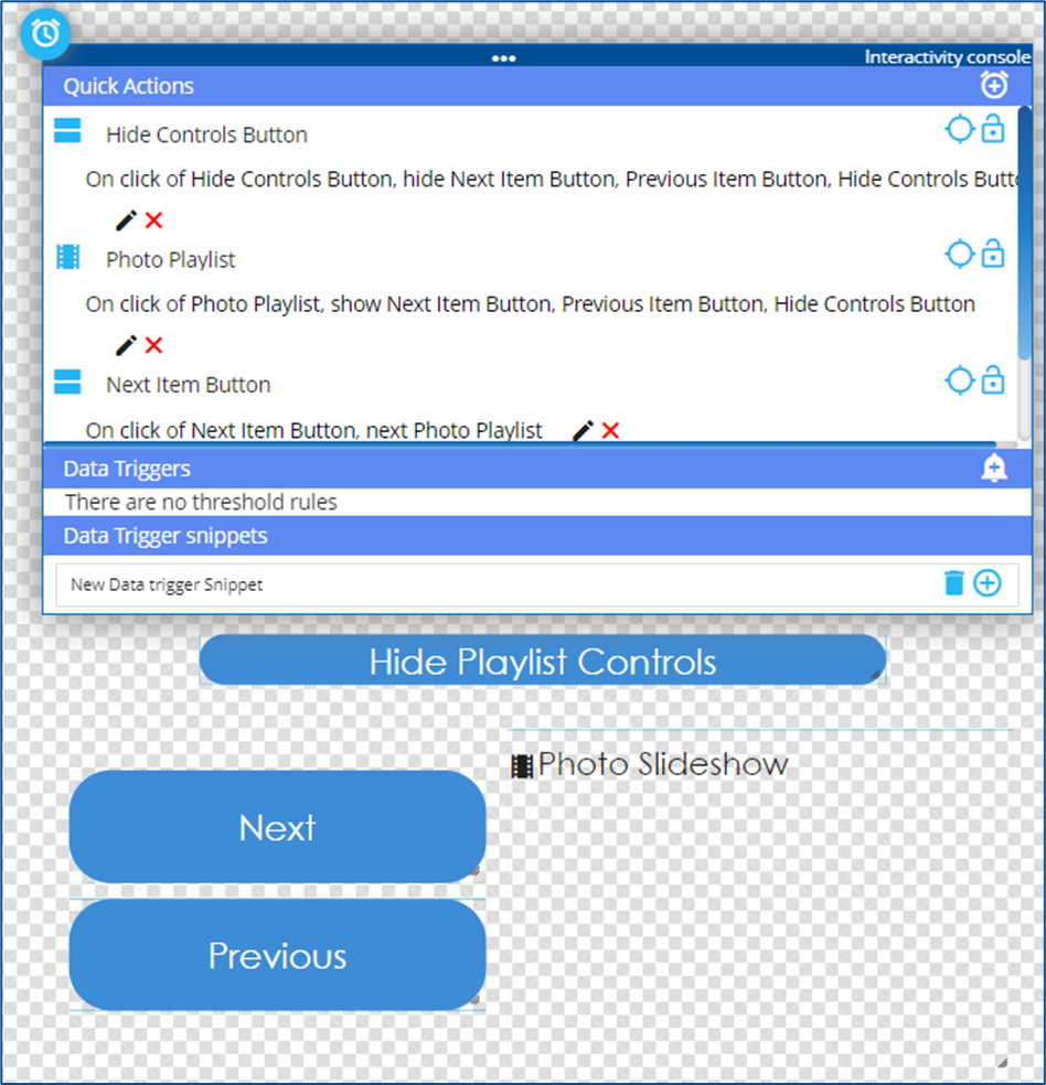
- Multiple Actions can be created, and any element can be treated as the trigger element
- Multiple elements can also be targeted with the action
- In this example, a user clicking on the playlist is the trigger for showing the Playlist controls and making a hide controls button seen
- Clicking the Hide Controls button hides all the control buttons.
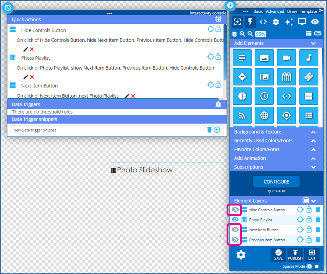
Note on Visibility Toggles
If it is intended that an item be hidden unless some action is taken then it needs to be toggled as hidden in the Element Layer list when the design is published.
This is done by manually toggling the visibility with the eyeball icon
From my previous example, if the controls are intended to be hidden until someone clicks the playlist I would need to hide the control elements in the layers before publishing.
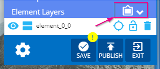
Animation Timeline
This feature opens a timeline panel on the bottom of your builder container where you can modify which animations occur for each element, and when they occur.
- Select the clipboard icon in element layers under the controls panel
- Once the timeline panel is open, you can start appending animations to your elements. Click anywhere on the timeline next to your element of choice and a popup with a list of animations will appear. If an animation is placed 10 seconds into the timeline, then the animation will not affect your element until after 10 seconds
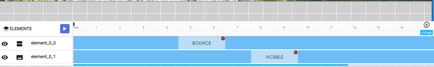
- After you are done adding animations to your elements in the timeline, click on the preview eye in the controls panel to view your animations in progress.
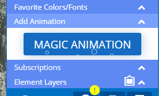
Magic Animation
This feature provides a set of special animations that can be applied to all elements within your layout.
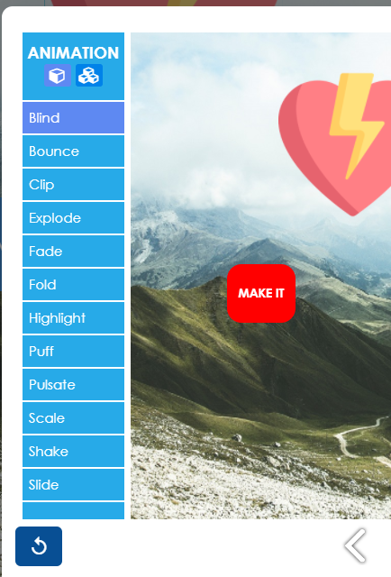
- Click on the Magic animation button under add animation in the controls panel and popup modal will appear.
- You can now select different animations for your elements. In the top left corner of the page under Animation, we have two buttons: Individual and Unison. Selecting Individual will have each element on the page animate in different orders and selecting Unison will have all elements animate at the same time. For more on how to control animations for your elements, refer to the animation timeline in this article.
Recent Colors/Fonts & Favorite Colors/Font
These sections of the control panel only affect Text-based elements such as Text-Note and Ticker
The Recently Used Colors/Fonts section shows the colors and fonts selected while editing the design.
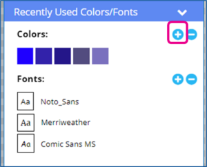
If you select a Color or Font in the Recently Used section, you can then click the blue Plus button to add that color or font to the Favorite Colors/Fonts section for use in other designs.
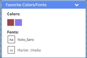
To use a Favorite or Recent color or font, open a Text Note or Ticker for editing, select your text to change, and click the recent or favorite color or font from the control panel to apply it.
Subscriptions
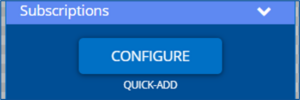
The Subscriptions section has the controls to integrate data into a design, giving the ability to view real-time information that is delivered to Korbyt through Data Integrations
For more details on Data Subscriptions and Data Integrations see:
Draw Control Panel
Drawing Options:
- Basic Styles – This is a set of common objects such as arrows and stars.
- Design Shapes – This is a set of common shapes that can be added to your layout.
- Speech bubble – This is a set of speech bubbles to add context to your layouts.
- Roll Your Own Shape – This is a set of tools you would find in a graphics editor that allows you to draw on your layout and create custom shapes.
- Selecting a brush or a shape will bring up a set of options where you can modify the color, width, shadow, and brush type.
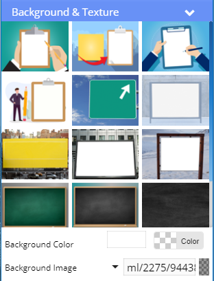
Background & Texture
In the builder controls panel, select Background & Texture to open up options that will change the background of your layout.
This feature includes a set of predefined images to select, a color picker, and an image selector.