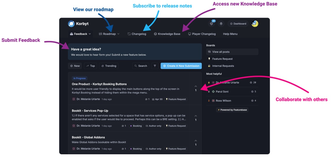
Our Knowledge Base Has Moved
The New Page landing page for the Knowledge Base is https://product.korbyt.com/help
The new version of this specific article can be found at: https://product.korbyt.com/en/help/articles/2233844-how-to-add-data-to-a-layout-or-message
Please update any of your bookmarks to the new Knowledge Base
For assistance on using the new Knowledge Base, we have a Welcome to the New Korbyt Knowledge Base guide
The new Korbyt Product Page also has sections for submitting feedback on system improvements, a view of our Roadmap of upcoming enhancements, and a change log of all updates.
Data that has been brought into Korbyt through a Data Intigration can be displayed on a Layout or Message through by configuring a Data Subscription.
You connect to the data in the Builder Tool control panel in the Subscriptions section
This “subscribes” the layout or message to a data table already built in Korbyt through Data Intigration and Data Adapters.
If you need assistance with Data Adapters, see the Working with Data Adapters and Data Integration article

The Subscription Section of the control panel will look different is a subscription has already been created or not
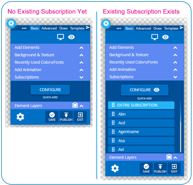
In Either Case, clicking the blue Configure button will open the menu to establish the data Subscription. This is the connection that links this design to a specific source of data within Korbyt.
This Guide will cover both
- Configuring Data Subscriptions
- This creates the connection between the data adapter and the design
- Making the Data Seen
- How to add and format the data for the final visual
Configuring a Data Subscription
Linking the data from an Adapter to the Layout or Message in the Builder Tool
The screenshots for Configuring a data subscription start from not having an existing subscription. Editing an existing subscription would show the same options just with the current value already filled in
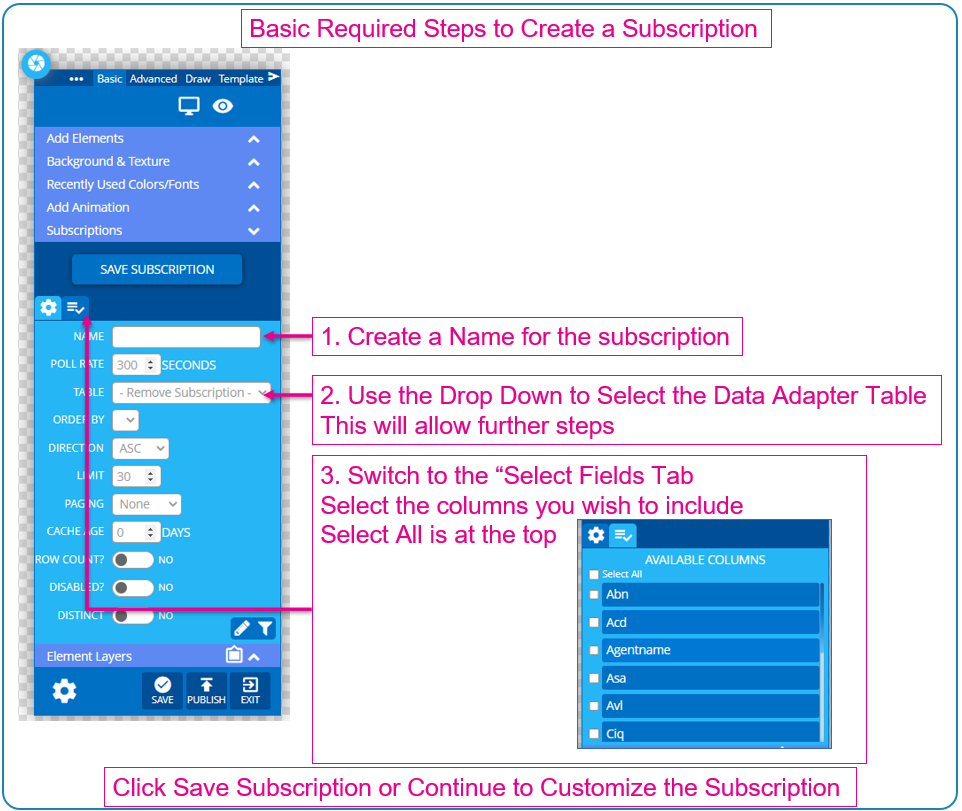
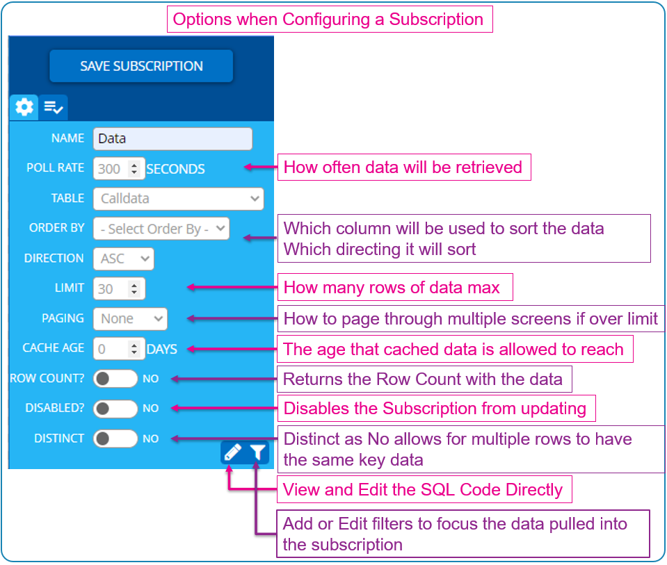
If you need more than 30 Rows of Data set the Limit number to 0, which will go through as many rows of data as there is. This will need to be used in conjunction with the Paging setting so that smaller sets of data are brough in and shown “paging through” untill all data is shown
If you are interested in Filtering the data that the Subscription draws in check out the article Data Subscriptions – Filtering
Making the Data Seen
Once you have Configured the Data Subscription to the Layout or Message see above steps you can add the data points to the canvas.
You add data to the Canvas by clicking and dragging the section of data in the Subscription Section to the screen.
You can add the Entire Subscription, or any specific Column of Data
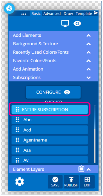
Once Added to the Canvas it can be customized througth Gear Settings Menu > Edit Element like other builder elements.
The Edit menu for Data Elements has three sections that you switch between using the buttons on the right side of the ribbon.
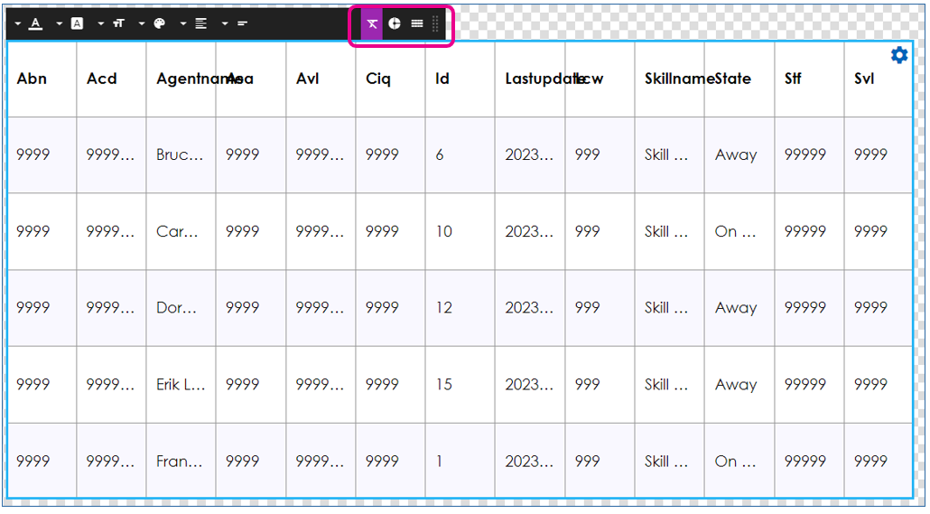
You can add multiple data elements to one layout, and each can be configured differently through it’s settings.
Below we will review the three menu sections for a Data Elements settings.
You can see which menu you are in by it’s Purple Highlight
Styles Menu

Style settings affect the Cells or Columns that you have clicked on to select in the table.
You can use Shift or CTRL keys in connection with clicking to select multiple at a time.
| Edit Icon | Description |
|---|---|
| Style select Bold, Italic, Underline, or any combination | |
| Font select what type face | |
| Font Size set the font size | |
| Text Color set the color of selected cells | |
| Alignment set the Vertical and Horizontal text alignment in the cell | |
| Wrap select for text to wrap or not-wrap within the cell |
Data Menu

Data Menu settings affect what data is shown on the screen.
| Edit Icon | Description |
|---|---|
| Rows select the number of rows to show on the screen | |
| Columns select which columns to show, and in what order. Click the X to remove a column, click and drag to reorder, and buttons to Add Columns |
|
| Format Mask set the data format for information on the table After selecting a data type (Data, Duration, Number…) you can select a format |
|
| Filters set a Row or Value filter on a column of data |
Table Menu

The Table settings let you control how the table is drawn on the screen
| Edit Icon | Description |
|---|---|
| Show Header toggles if the Header Row for the columns is shown You can also Edit the text in a Header Section at any time without breaking data linkages |
|
| Boarders select boarder widths, styles, colors Can be applied to entire table, or specific cells |
|
| Row Background Color set a background color for entire rows Can be applied separately to Odd and Even rows |
|
| Cell Background Color set a background color for a specific cell | |
| Padding set a value to shift the text based cell data away from the the cell wall This will pads in from either the left or right side if aligned to one of those |
Data Subscriptions added to other Elements
Instead of adding a data point or data table directly to a canvas you can also connect a data subscription to some other elements in the builder tool
Chart
You can drag a data point or data table on top of a Chart Element on the canvas to have to create a chart of the data
See How to Add a Chart Element for more information
Ticker

You can drag a data point onto a Ticker element to have it scroll the text that is in that data point
See How to Use a Ticker Element for more information

