Our Knowledge Base Has Moved
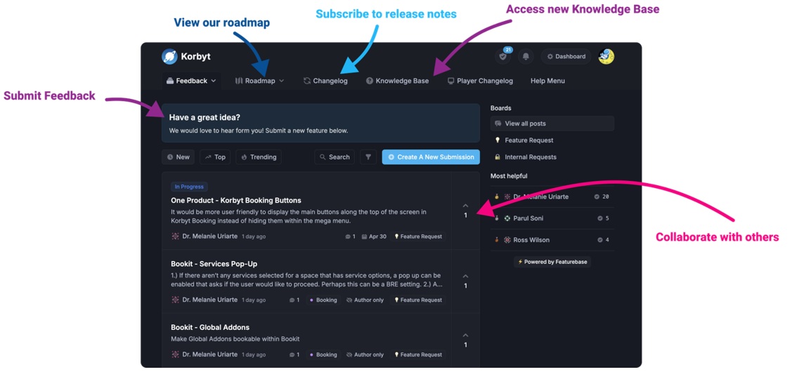
The New Page landing page for the Knowledge Base is https://product.korbyt.com/help
Guides for the Elements can be found at: https://product.korbyt.com/help/articles/6713513-layout-and-message-builder-elements
Please update any of your bookmarks to the new Knowledge Base
For assistance on using the new Knowledge Base, we have a Welcome to the New Korbyt Knowledge Base guide
The new Korbyt Product Page also has sections for submitting feedback on system improvements, a view of our Roadmap of upcoming enhancements, and a change log of all updates.
The Carousel Element allows you to setup a list of items inside of your layout. You can define the size of the area you want your media displayed and then pick multiple images, videos, other layouts, or messages to play inside that area. You can change the transition type and other options specific to each piece of media. Each carousel has a limit of 15 items.
A more powerful version of this can be accomplished by using the Playlist Element instead of building a Carousel.
Adding a Carousel Element?
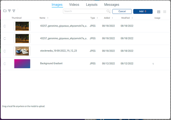
When you first add a Carousel Element it will open a window for you to select the items you would like to be part of the Carousel. Use the selection at the top to switch between available Images, Videos, Layouts, and Messages. Or drag and drop new files to upload from your computer.

Edit a Carousel Element Options
![]()
 Playlist
Adjust the items on the Carousel.
![]()
+ Add Media – Used to add media to your Carousel’s playlist. Clicking this will bring up your Korbyt Media Library. Check the boxes next to the media you would like to add, then scroll to the bottom and click Save.
+ Add External URL – Used to add the display of web pages to your carousel. Once clicked a dialog appears requesting you to type the URL, then click OK. You have the same duration and effect options as an image.
Image/Layout/Message/URL Display Options
![]()
Dotted Columns – Located on the far left side of the bar, clicking and dragging this allows you to re-order the image/Layout in the playlist.
Filename – Clicking the image/Layout filename brings up the Korbyt Media Library, from which you can select replacement media.
Duration – This specifies (in seconds) how long the image/Layout should display through each loop of the playlist.
Effect – Allows you to select the style of transition into this image/Layout.
Minus (-) button – Removes this image/Layout from the playlist.
Video Display Options
![]()
Dotted Columns – Located on the far left side of the bar, clicking and dragging this allows you to re-order the image in the playlist.
Filename – Clicking the video filename brings up the Korbyt Media Library, from which you can select replacement media.
Volume – Lets you adjust the volume of the video when it plays. All the way left is muted and all the way right is full volume.
Duration – This specifies (in seconds) how long the image/Layout should display through each loop of the playlist.
Effect – Allows you to select the style of transition into this image/Layout.
Minus (-) button – Removes this image/Layout from the playlist.
 Style
Style
The Style button gives you options to tweak the look of your Carousel and decide how media will display within it. Let’s look at the options you have.

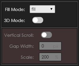
Fill Mode – You have 5 options for sizing your media within the carousel:
1) Cover – Fills the element with your image and adjusts when you resize the Element.
2) Fill – Fills the element with your image and crops when you resize the Element.
3) Contain – The image is scaled to maintain aspect ratio while staying within the Element.
4) None – No scaling performed. Media appears at actual size, regardless of the size of your carousel.
5) Scale-down – Nearly Identical to none or contain.
3D Mode – Overrides your selected transitions to provide a 3D ‘cover flow’ effect. Please note this is not recommended for use on low-end playback devices such a Chromeboxes, WebOS, or BrightSign.
Vertical Scroll – Plays the 3D animations in a vertical scroll, rather than horizontal (3D Mode Only.)
Gap Width – Specifies how far apart each piece of media is from each other in a 3D space.
Scale – Scales the size of the media, like a zoom function.
 Pause
Pause
Stops the Carousel from animating while editing in Builder. This does not affect playback in Preview or on a player.

