Our Knowledge Base Has Moved
The New Page landing page for the Knowledge Base is https://product.korbyt.com/help
Guides for the Elements can be found at: https://product.korbyt.com/help/articles/6713513-layout-and-message-builder-elements
Please update any of your bookmarks to the new Knowledge Base
For assistance on using the new Knowledge Base, we have a Welcome to the New Korbyt Knowledge Base guide
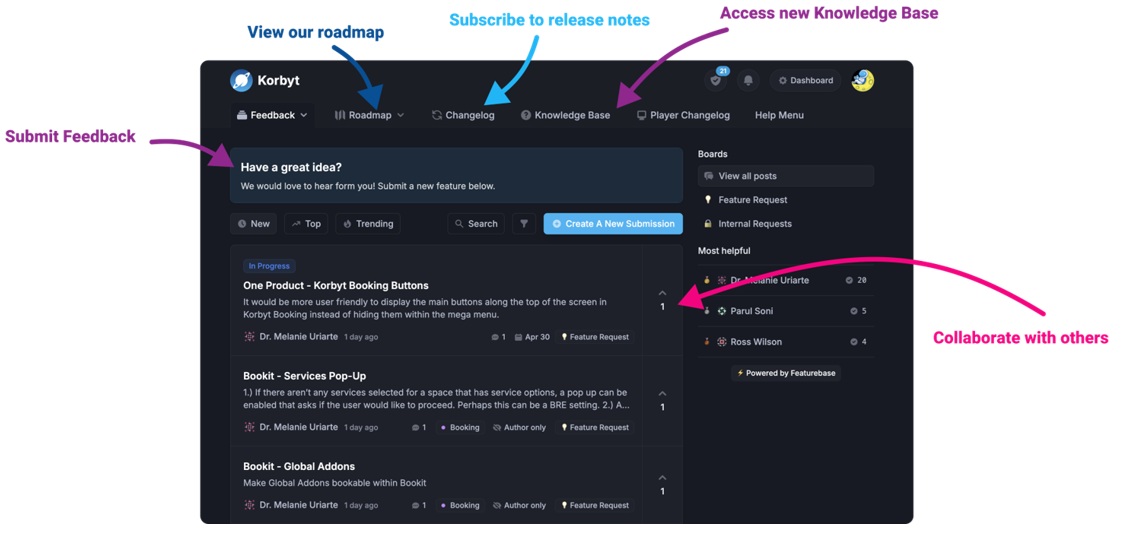
The new Korbyt Product Page also has sections for submitting feedback on system improvements, a view of our Roadmap of upcoming enhancements, and a change log of all updates.
What is the Button Element?
The Button Element makes it easy for you to place and customize a button that can be used in interactive kiosk applications. You can customize nearly every aspect of the look and feel. Knowledge of JavaScript, jQuery, or at least CSS selector’s and Korbyt’s Quick Actions feature is required to use this Element effectively.
Button Element Options
![]()
 Icon
Icon
With this option, you can choose a small picture to accompany the text on your button. Let’s look at the options you can choose from for your button icon.
![]() Trash can – Located in the upper right hand corner after selecting an icon, this allows you to remove the selected icon from your button.
Trash can – Located in the upper right hand corner after selecting an icon, this allows you to remove the selected icon from your button.
Material Tab – This tab contains ‘Material Design’ icons you can choose. Click any one of them to select it for use on your button.
Font Awesome Tab – This tab contains icons from Font Awesome, with a few additional options.
![]()
Spin – Checking this box will cause your icon to continuously spin when displayed.
Rotate/Flip – This options allows you to rotate or flip your icon to be displayed in a different orientation of your choosing.
 Button Styles
Button Styles allow you to customize the look and feel of your button when it is displayed, when a cursor is hovering over it, and when it is active. Let’s look at everything you can customize!
Standard Tab

BG Color – Allows you to change the background color of the button.
- The down arrow allows you to choose your color with a color picker tool.
- You can change the HEX text to type a hexadecimal color value.
- The small transparent column to the right of the HEX code makes your button background transparent.
- The dropper icon on the far right lets you choose a color that is already on your layout.
Transition – Allows you to set a time (in seconds) for the button animation when it is first displayed and for changing when hovered or clicked.
Border – Allows you to add a border to your button. The thickness of the border is measured in vmin.
- The dropdown allows you to choose the style of your border.
- The black square next to the dropdown allows you to choose the color of your border, using a color picker tool.
Shadow – These four vmin measurements correspond to different aspects of a drop shadow you can add to your button, in order from left to right, they are:
- Horizontal Offset – How far to the right the shadow will begin.
- Vertical Offset – How far down the shadow will begin.
- Blur Radius – The radius of the blur effect on the shadow. If set to zero, the shadow will be very sharp, as the number increases, it gets more blurry.
- Spread radius – How far out the shadow spreads from the button.
The black box to the right of the measurements allows you to choose the color of the shadow.
Border Radius – This is a measurement of how rounded the corners of your button border will be.
Image – Allows you to set a background image for your button.
Image Size – The size of your image within the button. The options are listed below. These selection conform the CSS background-size properties. More information can be found here.
- Inherit – Size is set by the value you selected for the layout background.
- Cover – Image will cover the whole surface of the button, even if it requires cropping or stretching.
- Contain – Always displays the full image while maintaining aspect ratio, regardless of the button size.
- Auto – The image will be displayed a its original size, with no scaling of any kind.
- Custom – Allows you to set the height and width of the image as percentages.
Image Repeat – This option will display the image over and over in a grid style. This can be useful for smaller square images to create textured effects. The available options are listed below. These values conform to the CSS background-repeat properties. More information can be found here.
- No-repeat – Displays the image a single time without repeating.
- Repeat – Displays the image multiple times vertically and horizontally in a grid. The last image can be cropped if it doesn’t fit.
- Repeat-x – Displays the image multiple times horizontally in a row.
- Repeat-y – Displays the image multiple times vertically in a column.
- Round – The image is repeated and squished or stretched to fill gaps.
- Space – The background image is repeated as much as possible without clipping. The first and last images are anchored to the sides on the button and then repeated between them with whitespace distributed evenly between them.
Image Position – Allows you to justify the image to an area of the button. Valid selections are listed below. All values default to center if not specified. These values conform to the CSS background-position properties. More information can be found here.
- left top
- left center
- left bottom
- right top
- right center
- right bottom
- center top
- center center
- center bottom
Hover Tab
This tab contains all of the same options as the Standard tab (listed above.) The difference is the customization’s you select here will only be visible is someone has moved a mouse cursor over the button, but has not clicked it. The provides a nice effect that indicates to the user they have moved their cursor over the button. If you do not set values for this, they will all be inherited from the Standard tab.
Active Tab
This tab contains all of the same options as the Standard tab (listed above.) The difference is the customization’s you select here will only be visible if the button has been programmatically set to an active state. The Active state is used in JavaScript or jQuery after the button has been pressed to indicate that whatever action to be taken when the button is clicked, is still taking place.
 Icon Styles
Icon Styles allow you to customize the look and feel of your icon when it is displayed, when a cursor is hovering over it, and when it is active. Let’s look at everything you can customize!
Standard Tab
![]()
Text Color – Sets the color of the icon itself.
- The down arrow allows you to choose your color with a color picker tool.
- You can change the HEX text to type a hexadecimal color value.
- The small transparent column to the right of the HEX code makes your button background transparent.
- The dropper icon on the far right lets you choose a color that is already on your layout.
BG Color – Sets the color of the background behind the icon only. The controls work the same as they do for the Text Color (listed above.)
Font Size – Changes the size of the icon. Measured in vmin.
Font weight – Makes the lines of the icon thicker and the icon itself slightly larger.
Text Shadow – These three vmin measurements correspond to different aspects of a drop shadow you can add to the icon shape itself, in order from left to right, they are:
- Horizontal Offset – How far to the right the shadow will begin.
- Vertical Offset – How far down the shadow will begin.
- Blur Radius – The radius of the blur effect on the shadow. If set to zero, the shadow will be very sharp, as the number increases, it gets more blurry.
The black box to the right of the measurements allows you to choose the color of the shadow.
Transition – Allows you to set a time (in seconds) for the icon animation when it is first displayed and for changing when hovered or clicked. The default is inherited which will match the transition time you set under the Button Styles on the Standard Tab.
Border – Allows you to add a square border around your icon. The thickness of the border is measured in vmin.
- The dropdown allows you to choose the style of your border. Inherit will aply the same border that you selected under Button Styles on the standard tab, but the color and size are not inherited.
- The black square next to the dropdown allows you to choose the color of your border, using a color picker tool.
Shadow – These four vmin measurements correspond to different aspects of a drop shadow you can add around the border of your icon, not the icon shape itself. In order from left to right, they are:
- Horizontal Offset – How far to the right the shadow will begin.
- Vertical Offset – How far down the shadow will begin.
- Blur Radius – The radius of the blur effect on the shadow. If set to zero, the shadow will be very sharp, as the number increases, it gets more blurry.
- Spread radius – How far out the shadow spreads from the icon.
The black box to the right of the measurements allows you to choose the color of the shadow.
Border Radius – This is a measurement of how rounded the corners of your icon borders will be. Inherit applies the setting you indicated under Button Styles in the Standard Tab.
Hover Tab
This tab contains all of the same options as the Standard tab (listed above.) The difference is the customization’s you select here will only be visible is someone has moved a mouse cursor over the button, but has not clicked it. The provides a nice effect that indicates to the user they have moved their cursor over the button. If you do not set values for this, they will all be inherited from the Standard tab.
Active Tab
This tab contains all of the same options as the Standard tab (listed above.) The difference is the customization’s you select here will only be visible if the button has been programmatically set to an active state. The Active state is used in JavaScript or jQuery after the button has been pressed to indicate that whatever action to be taken when the button is clicked, is still taking place.
 Text Styles
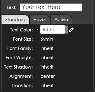
Text Styles allows you to set the words you would like to be displayed on the button and style them as you would like. All of your options are listed below.

Text – Type the text in the field that you would like displayed on your button.
Standard Tab
Text Color – Sets the color of your button text.
- The down arrow allows you to choose your color with a color picker tool.
- You can change the HEX text to type a hexadecimal color value.
- The small transparent column to the right of the HEX code makes your button background transparent.
- The dropper icon on the far right lets you choose a color that is already on your layout.
Font Size – Changes the size of the icon. Measured in vmin.
Font Family – Select the typeface you would like the text displayed as.
Font Weight – Makes the lines of the icon thicker and the icon itself slightly larger.
Text Shadow – These three vmin measurements correspond to different aspects of a drop shadow you can add to your button text, in order from left to right, they are:
- Horizontal Offset – How far to the right the shadow will begin.
- Vertical Offset – How far down the shadow will begin.
- Blur Radius – The radius of the blur effect on the shadow. If set to zero, the shadow will be very sharp, as the number increases, it gets more blurry.
The black box to the right of the measurements allows you to choose the color of the shadow.
Alignment – Specifies the alignment of the text within the button. Options are listed below.
- Inherit – Applies the default for the button, which is center.
- Left – Aligns your text to the left side of the button.
- Center – Aligns your text to the center of the button.
- Right – Aligns your text to the right side of the button.
- Justify – Stretches each line to an equal width.
Transition – Allows you to set a time (in seconds) for the text animation when it is first displayed and for changing when hovered or clicked. The default is inherited which will match the transition time you set under the Button Styles on the Standard Tab.
Hover Tab
This tab contains all of the same options as the Standard tab (listed above.) The difference is the customization’s you select here will only be visible is someone has moved a mouse cursor over the button, but has not clicked it. The provides a nice effect that indicates to the user they have moved their cursor over the button. If you do not set values for this, they will all be inherited from the Standard tab.
Active Tab
This tab contains all of the same options as the Standard tab (listed above.) The difference is the customization’s you select here will only be visible if the button has been programmatically set to an active state. The Active state is used in JavaScript or jQuery after the button has been pressed to indicate that whatever action to be taken when the button is clicked, is still taking place.

