Our Knowledge Base Has Moved
The New Page landing page for the Knowledge Base is https://product.korbyt.com/help
Guides for the Elements can be found at: https://product.korbyt.com/help/articles/6713513-layout-and-message-builder-elements
Please update any of your bookmarks to the new Knowledge Base
For assistance on using the new Knowledge Base, we have a Welcome to the New Korbyt Knowledge Base guide
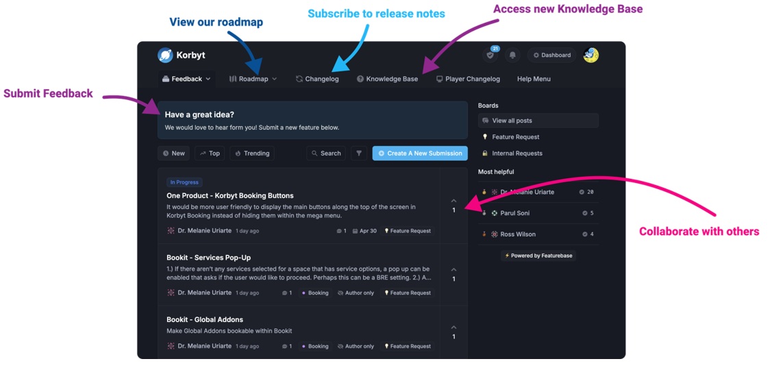
The new Korbyt Product Page also has sections for submitting feedback on system improvements, a view of our Roadmap of upcoming enhancements, and a change log of all updates.
Media-Grid is an element within the layout builder.
This Element will bring multiple pieces of media from one specific folder and will display them in a grid in the Layout.
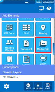
 This is the Media-Grid Icon in the Element Builder.
How to Add the Media Grid Element
- From the builder, drag the Media-Grid icon and drop it on the canvas.
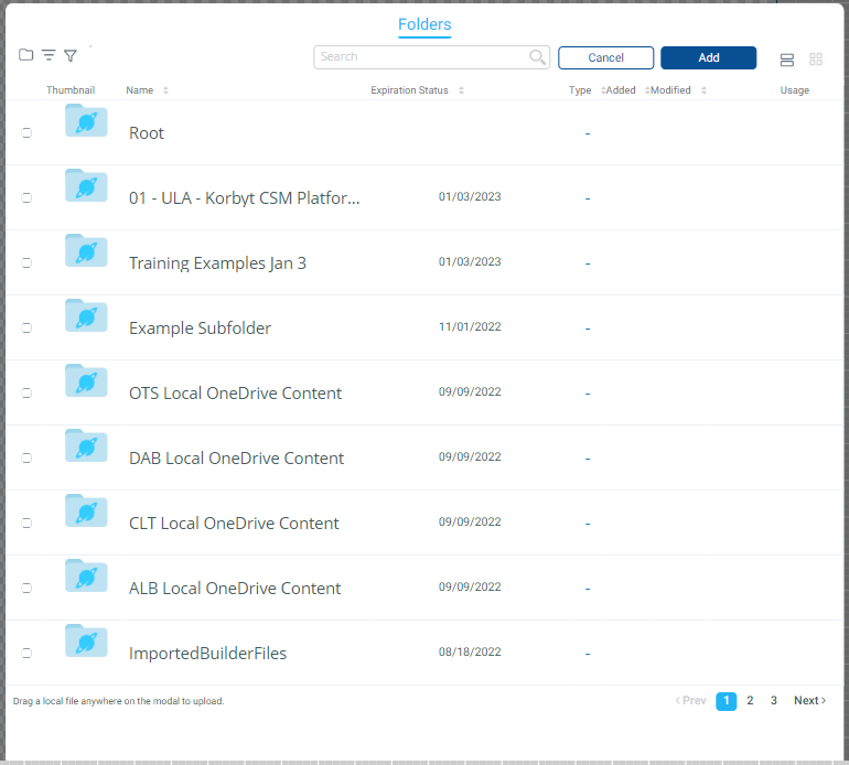
- You will then be prompted to select the folder where the media resides.
- Select the Folder and then click “Add” button to complete the selection.
- The Multi-Media Element will display in a grid format with the Media that resides within the folder selected.
- It can be one image or multiple images that display depending on how many images are available in the selected folder.
- the folder that is selected has to contain content at the time when you add the element to the layout
- the folder can not be empty
- The result will have multiple elements display
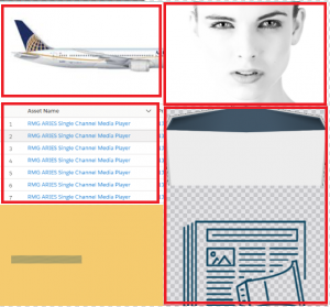
- Different options can be set in the Media Grid options to control how the items present.
Media-Grid Element Options

Icons
- Choose Image – This button allows the user to select the folder in the media library where the images reside. The images located in that folder will be displayed.

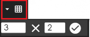
- Grid – This button allows the user to set the grid options for how many columns and rows they wish to display.
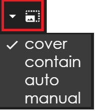
- Size –This button allows the user to select how to display the images in the grid cell. Options include size, cover, contain, auto and manual. Click the desired one to select it.
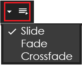
- Animation – This button allows the user to set the transition used as the cells rotate to additional images.
- Padding – This button allows the user to select the padding. Normal and Padding are the two available options.
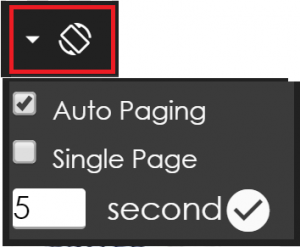
- Auto Paging – This button allows the user to set the Auto Paging options. Available options are Auto Paging, Single Page and Seconds per page.
- Swiper Option – This button allows the user to set the Swiper Option for interactive swiping to Enable Swipe and Enable Full Screen Swipe.
