Our Knowledge Base Has Moved
The New Page landing page for the Knowledge Base is https://product.korbyt.com/help
The new version of this specific article can be found at: https://product.korbyt.com/help/articles/5274066-branding-controls-for-signage-desktop-and-mobile-and-web
Please update any of your bookmarks to the new Knowledge Base
For assistance on using the new Knowledge Base, we have a Welcome to the New Korbyt Knowledge Base guide
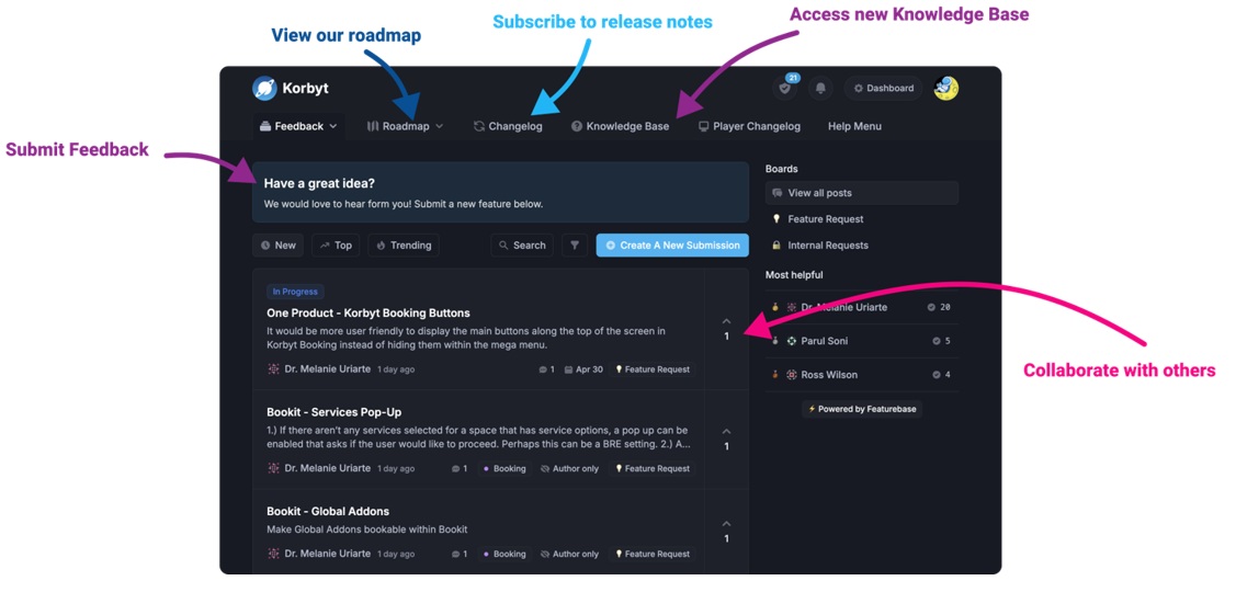
The new Korbyt Product Page also has sections for submitting feedback on system improvements, a view of our Roadmap of upcoming enhancements, and a change log of all updates.
![]()
Adhere to the following branding guidelines:
| Brand Element |
Usage |
Example |
Colors
|
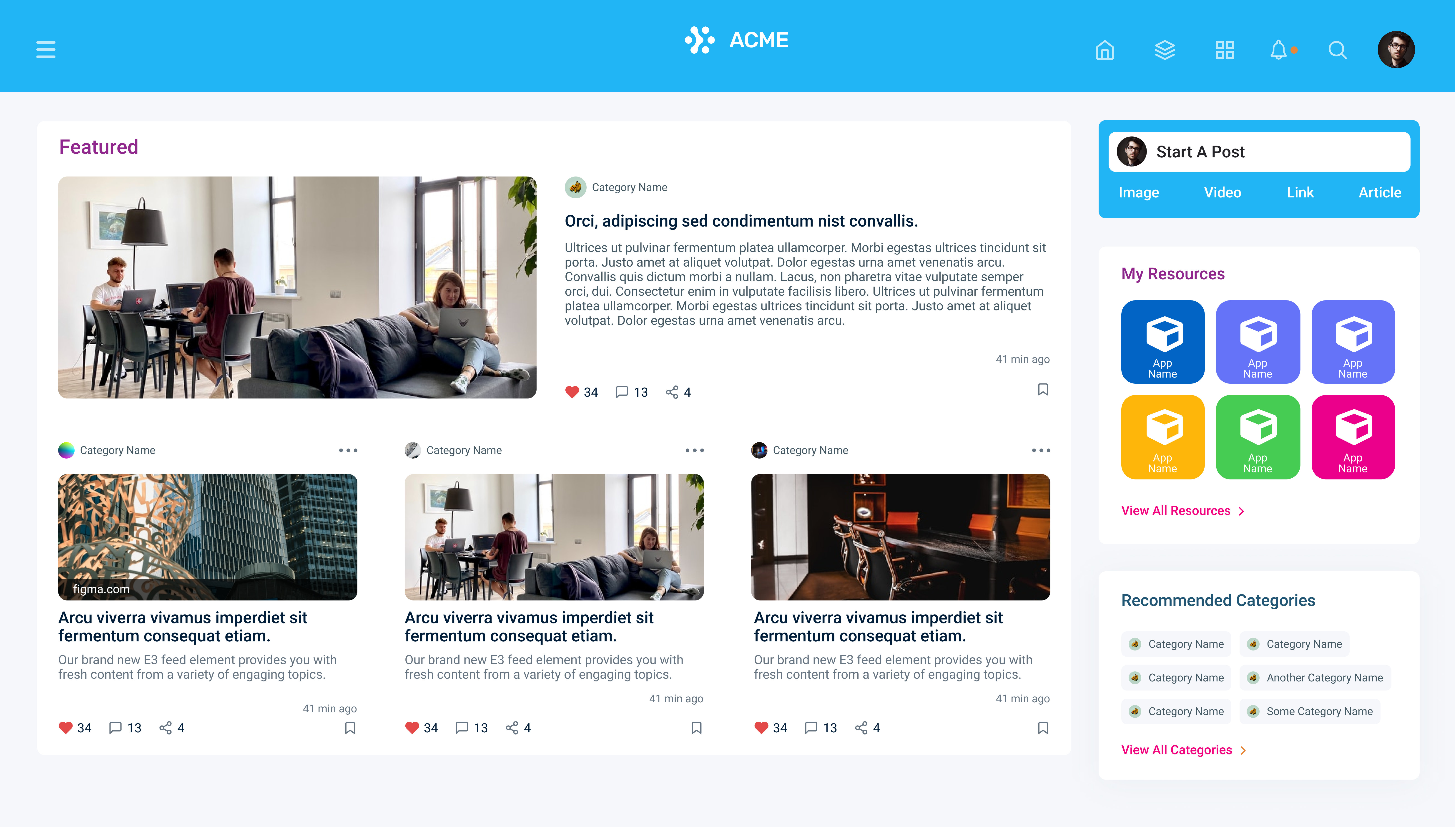
Colors are used throughout the Korbyt Anywhere mobile app and web interface as follows:
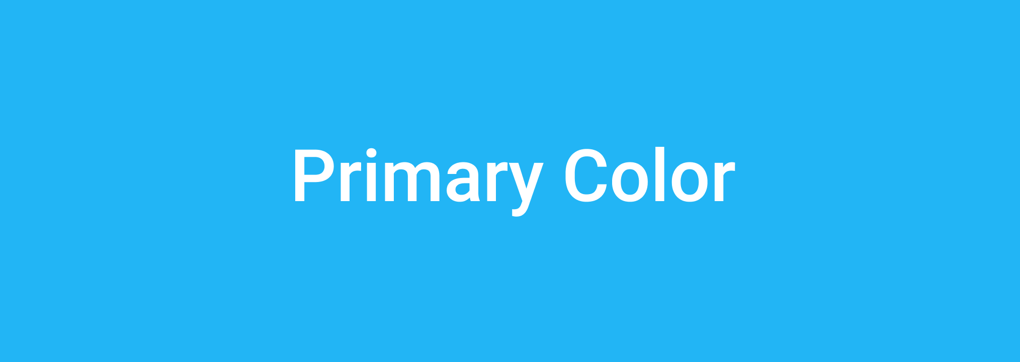
- Primary Color: Used as the basis for your branding efforts throughout the Korbyt Anywhere desktop and mobile applications and and web experience. In the Korbyt Anywhere web interface, it’s used for the header, footer, and backdrop for posts.
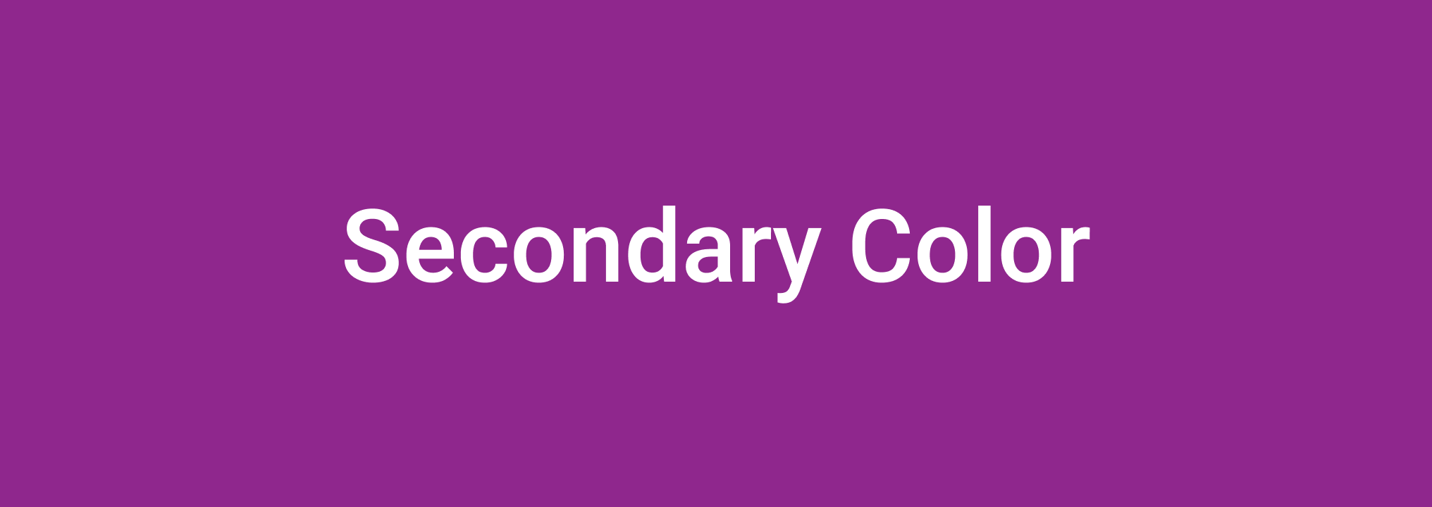
- Secondary Color: Used for page and section titles across the web interface.
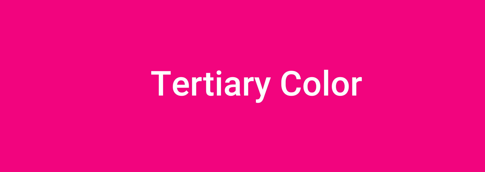
- Tertiary Color: In the Korbyt Anywhere mobile app, the tertiary color is used for navigation buttons, add content, and subscribe to categories. In the Korbyt Anywhere web interface, the tertiary color is used for links that point to resources, categories, and subscribe to categories.
 We recommend that you use a different color for your tertiary color and your login page background color. Otherwise, it will be difficult for users to see the login button. We recommend that you use a different color for your tertiary color and your login page background color. Otherwise, it will be difficult for users to see the login button.
|
Web Experience
|
Logos
|
Stacked logos and favicons enhance brand awareness. The recommended sizes and aspect ratios are as follows:
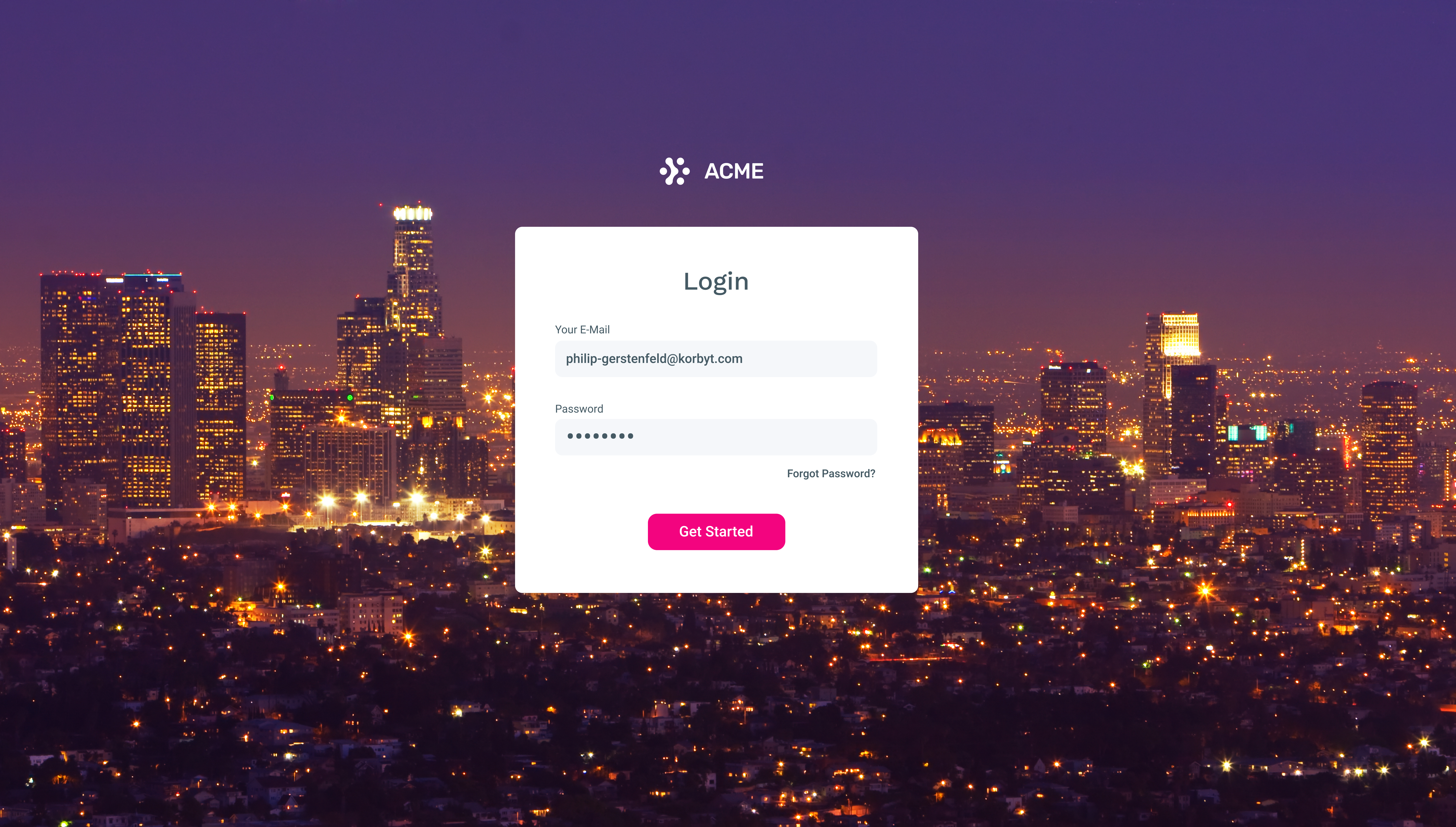
- Stacked Logo: Appears in both the Korbyt Anywhere mobile app and web interface within the login screen and header.
- Size: 120px X 60px
- Aspect Ratio: 2:1
- Favicon: Appears in the Browser tab when accessing the Korbyt Anywhere web interface.
- Size: 16px X 16px
- Aspect Ratio: 1:1
Stacked logos and favicons should be uploaded as PNG files. |
Mobile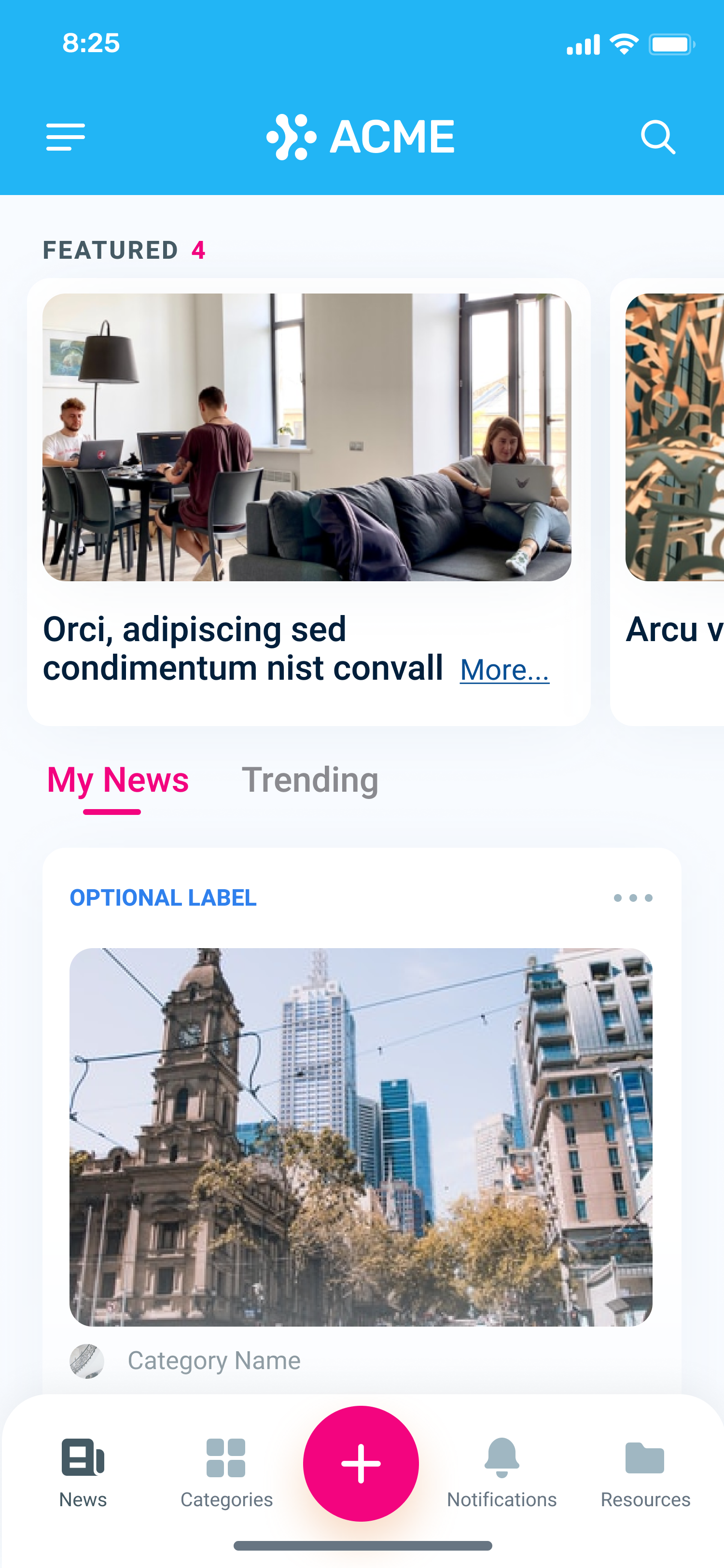 Favicon Favicon |
Icons
|
Icons for the following are supported:
- Custom Loader: Appears in the form of a GIF while the network loads the requested page within the Korbyt Anywhere web interface if the user is on a slower network. Some pages may take longer to load.
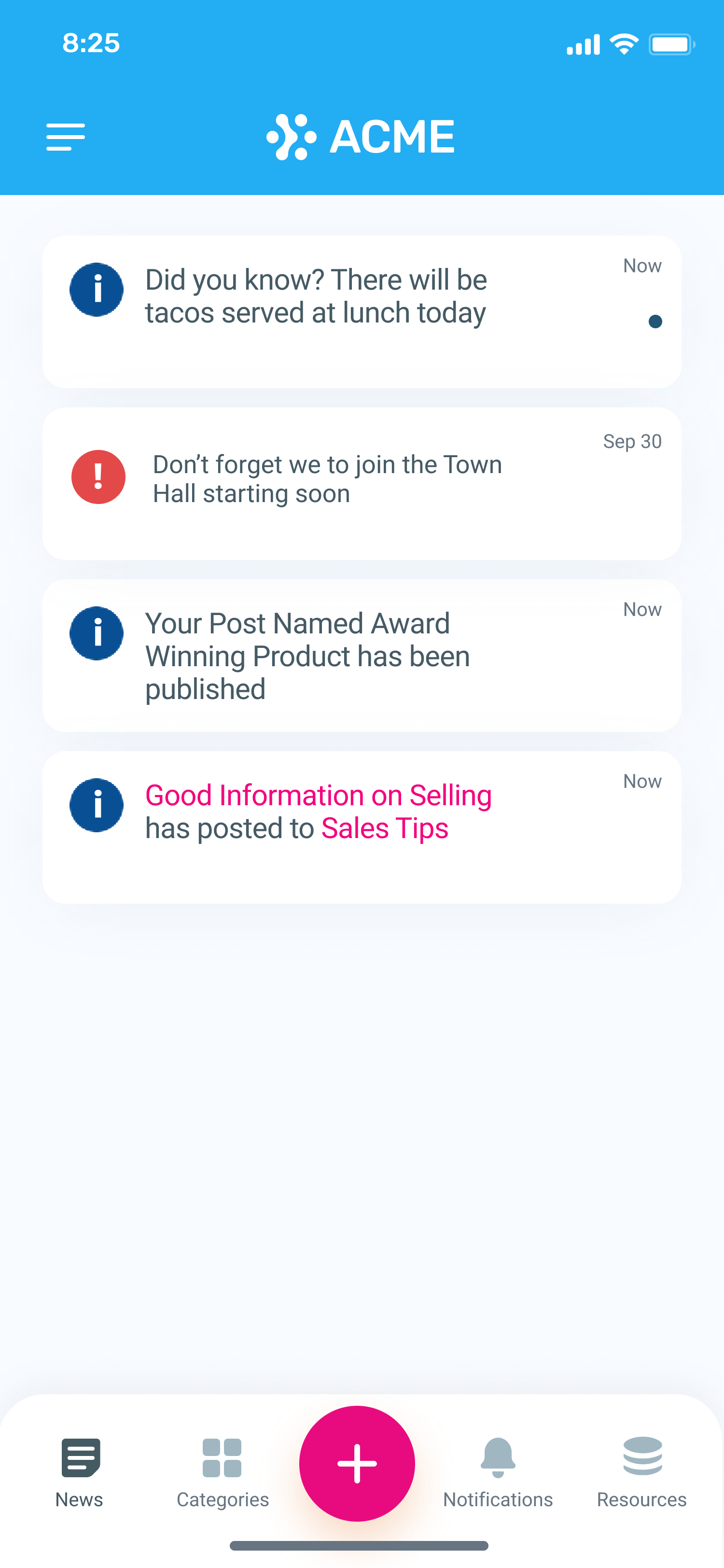
- Push Notification: Provides general information to the user and appears in the Notifications menu within the Korbyt Anywhere mobile app and web interface.
- Urgent Alert: Provides critical information to the user and appears in the Notifications menu within the Korbyt Anywhere mobile app and web interface.
The recommended size and aspect ratio are as follows:
- Size: 250px X 250px
- Aspect Ratio: 1:1
We support ICO files. |
 |
Backgrounds
|
Backgrounds can be either a solid color or an image within the Korbyt Anywhere mobile app or web interface. |
 |
Post Images
|
The recommended size and aspect ratio for post images are as follows:
- Size: 1100px X 500px
- Aspect Ratio: 2:1
|
|
Category Images
|
The recommended size and aspect ratio for post images are as follows:
- Size: 100px X 100px (appears in the form of a circle)
- Aspect Ratio: 1:1
|
|
